 |
|


 Oct 11, 2009, 06:23 PM // 18:23
|
#1 |
|
Academy Page
Join Date: Sep 2009
Profession: Mo/
|
 Gwee's Art Dump
Hai guys and girlies.
Here's a lil art dump, I've pretty much only just got back into painting in the last few weeks after a year+ break from any serious art. Here's a lil commision of some guildies characters. <3  Also been working on an art trade with a friend. Progress so far at the 3h30m mark:  Any crit would be awesome. 
|

|

|
|
Oct 11, 2009, 06:27 PM // 18:27
|
#2 |
|
Site Contributor
Join Date: Mar 2008
Location: UK/norway
Guild: Order Of The Etherbloom Crown [ZEN]
|
That's great, Gwee!
 I really like the first one, in particular. I really like the first one, in particular.I think you should finish your Halloween entry! >.<'' |
|
|
|
|
Oct 11, 2009, 06:30 PM // 18:30
|
#3 | |
|
Academy Page
Join Date: Sep 2009
Profession: Mo/
|
Quote:
Still thinking or redoing it, waiting on that spark of inspiration.
|
|
|
|
|

|
Oct 11, 2009, 08:58 PM // 20:58
|
#4 |
|
Forge Runner
Join Date: Mar 2006
Location: Mableton, Georgia
Guild: Guild Ancestors Reunited [ギルド]
|
1st one: rather decent
2nd one: mediocre...ish The first picture... The ranger's mask reminds me so much of Rain from Mortal Kombat.... O.0 ~LeNa~
Last edited by jonnieboi05; Oct 11, 2009 at 09:01 PM // 21:01.. |
|
|
|
|
Oct 11, 2009, 09:19 PM // 21:19
|
#5 |
|
Academy Page
Join Date: Sep 2005
Location: Australia
Guild: Squee Squeeeeeeeeeeeeeeeeeeeeee [yay]
|
I'm loving them both Gwee! (and the name too because it rhymes with Squeee *o*)
The rendering on the chaos gloves in the first pic looks really good in particular, forget detail I think they would be one of the more difficult pieces in the gw armory to render realisticly. The ele's face is also very striking (I think its the nice detail, like the lighting on the nose, that keeps drawing my eye back). Composition-wise I think you could have afforded to keep the background darker/muted but still a great piece. I'll have to disagree with others though as for some reason I like the 2nd pic more. At least the potential? I love the colours and so far, the only thing that would bother me too much out of the more complete rendered sections is maybe the perspective between the shoulders up and waist down don't add up/mesh quite right? (But I'm mainly going off instinct here as I think my eye isn't quite back into practice yet so feel free to disregard >: ) Hope to see more work soon! |
|
|
|
|
Oct 12, 2009, 12:52 AM // 00:52
|
#6 |
|
Krytan Explorer
Join Date: Apr 2007
Location: State of Nolani
Guild: When the trolling stops, the drawing stops too
Profession: W/
|
looking good
|
|
|
|
|
Oct 12, 2009, 12:58 PM // 12:58
|
#7 | |||
|
Academy Page
Join Date: Sep 2009
Profession: Mo/
|
Quote:
Quote:
Thanks for the input on my wip. It's really appreciated. Anyways I'll take a look at her armour an how it should rest on her. I'm working with many screen-shots and references so it gets a little muddled sometimes. Quote:
Here's todays progress as of 5h in. 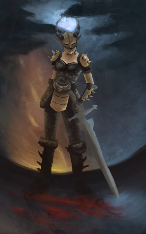 Worked mainly on background and values not really the figure. |
|||
|
|
|
|
Oct 12, 2009, 04:32 PM // 16:32
|
#8 |
|
Wilds Pathfinder
Join Date: Mar 2006
Location: CA
Profession: N/
|
I like the feel of the back ground, but something that might make it stronger is if you changed where the moon is. Right now, the horns on her helm is framing it almost perfectly, and it looks kind of strange :P I think you silhouette the horns a bit more, it would make them a lot more apparent.
|
|
|
|
|
Oct 12, 2009, 05:42 PM // 17:42
|
#9 | |
|
Academy Page
Join Date: Sep 2009
Profession: Mo/
|
Quote:
Last of today's updates. 6h30m mark:  Refined things mostly, no big changes. Also remembered her armour is silver :/ |
|
|
|
|
|
Oct 13, 2009, 04:47 AM // 04:47
|
#10 |
|
Academy Page
Join Date: Sep 2005
Location: Australia
Guild: Squee Squeeeeeeeeeeeeeeeeeeeeee [yay]
|
It's looking great Gwee! I'm not really sure what you could/want to do either but maybe you could trim the shape of the moon down a bit to create a bit more space, or revise the horns on the helm to the thinner, less fleshed-out shapes of your previous WIPs you have shown (personally I thought the way they were done in the first sketch looked really cool >_> very fine stroke at the top with really only a bolder base, also had the little kink at the top which might also vary the line of the horn to the line of the moon.)
I think the moon itself does look really well done though, but tbh the symmetry/framing with the horn isn't too glaring for me. The pose seems more cohesive now too, perhaps the comparatively flat render of the first pic played tricks on me >_< Can't wait to see the final product Gwee awesome work *o* |
|
|
|
|
Oct 13, 2009, 05:19 AM // 05:19
|
#11 |
|
Krytan Explorer
Join Date: Apr 2007
Location: State of Nolani
Guild: When the trolling stops, the drawing stops too
Profession: W/
|
the first thing i notice about ur warrior painting is that everything is almost smack down in the middle. The moon, the warrior, the fire, the blood (i think its blood) on the ground.
Although there's nothing wrong with that, it might be interesting to play with the positioning of all the elements on ur painting (assuming they are on separate layers) and explore the use of the canvas rather than keeping its elements in aforesaid linear position. Having said that, at the end of the day it is your painting and whats important is that YOU are happy. There are popular "guidelines" about composition but by no means are they hard and fast rules to adhere to. There is the common practice of dividing the canvas into thirds for which there is a quick tutorial here Other than that i think its looking fantastic.
|
|
|
|
|
Oct 18, 2009, 08:27 PM // 20:27
|
#12 |
|
Academy Page
Join Date: Sep 2009
Profession: Mo/
|
Thanks for the comments. I hope I took some of it to heart, here's it finished.
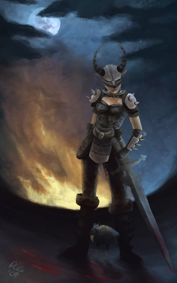 Nothing really special, but I think it's cute lol. (Moa added as requested hehe) |
|
|
|
|
Oct 18, 2009, 08:31 PM // 20:31
|
#13 |
|
Desert Nomad
Join Date: Mar 2007
Location: UK/Austria
Guild: [bone]
Profession: P/
|
ohoo very nice
I like the off-centered position in the final one, it gives the whole picture a lot more tension. I also love how the helmet is almost part of the face, looks great! I think the sword could have done with some sharper edges, but that's just a blade fanatic speaking, really  good job! good job!
|
|
|
|
|
Oct 18, 2009, 08:44 PM // 20:44
|
#14 | |
|
Academy Page
Join Date: Sep 2009
Profession: Mo/
|
Quote:
Be glad there's a blade at all not just a line hahaha.
|
|
|
|
|
|
Oct 18, 2009, 09:51 PM // 21:51
|
#15 |
|
Jungle Guide
Join Date: Apr 2006
Location: California, USA
Guild: Vulpes Velox [Fox]
Profession: Me/
|
Another great artist at Nolani.
I love me some GW couple art haha. Also was nice to see the progress of the warrior one, I have to agree with Morag that the off center version looks much much better, as well as the fact that in the other pictures there seemed to be too much ground. Fixed it nicely though!
|
|
|
|
|
Oct 20, 2009, 02:55 PM // 14:55
|
#16 | |
|
Academy Page
Join Date: Sep 2009
Profession: Mo/
|
Quote:
Here's a lil sketch, we all know who this is hehe: 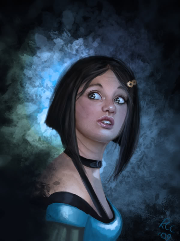 And a lil close up about 70% of actual size I believe. 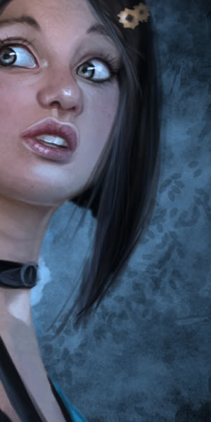
|
|
|
|
|
|
Oct 20, 2009, 06:10 PM // 18:10
|
#17 |
|
Furnace Stoker
Join Date: Dec 2006
Guild: [Bone]
Profession: Mo/
|
Do I win something when I say that's gwen?
But for real, very nice! Really like it. Just think her lower cheek should be a little more to the right (for us right  ) )And about you saying a little sketch, I just love it the way it is, imo don't chance the bg |
|
|
|
|
Oct 20, 2009, 06:14 PM // 18:14
|
#18 |
|
Wilds Pathfinder
Join Date: Jul 2006
Location: Away from you.
Profession: W/
|
That warrior one? It honestly looks like viable concept art if you had worked for A.net themselves.
|
|
|
|
|
Oct 20, 2009, 07:30 PM // 19:30
|
#19 | ||
|
Academy Page
Join Date: Sep 2009
Profession: Mo/
|
Quote:
Yeah there are a few issues with that one, I kinda just raged quitted from it and hodged together a background :/ Eyes are obviously a bit too large but I like it like that somehow. She looks a little more innocent in this than the big frown she became in EOTN. Quote:
|
||
|
|
|
|
Oct 20, 2009, 09:19 PM // 21:19
|
#20 |
|
Academy Page
Join Date: Sep 2005
Location: Australia
Guild: Squee Squeeeeeeeeeeeeeeeeeeeeee [yay]
|
I really love the gwen gwee! The face looks amazing (detail! lighting! *o*) and yeah I was going to say she doesn't look peeved off enough to be gwen but I think I prefer her this way.
Last edited by Baibai; Oct 21, 2009 at 07:57 AM // 07:57.. |
|
|
|
 |
|

«
Previous Thread
|
Next Thread
»
| Thread Tools | |
| Display Modes | |


 Linear Mode

|
|

All times are GMT. The time now is 05:27 AM // 05:27.
